
A Korean-inspired writing system with surprisingly familiar origins: direct descent from the Latin alphabet.
About the creator
My name is Gabriel and I’ve been interested in design for a long time. My dad works with video editing, so I’ve been exposed to digital design and film making from a young age, especially with programs like Photoshop and Premier, although I never professionalized in it.
A few years ago, I started making flag designs for fictional countries and posted them on my Reddit account, gbrcalil. Some of them got really popular and were praised for their good design. This is part of what triggered my hobby as a designer.
My hobby of studying linguistics, however, was triggered by me getting in a relationship with a foreigner, which made me want to learn their native language. After studying it for a while, a strong interest in linguistics arose in me, which eventually led me to discover the world of conlanging. This then introduced me to the world of neography and, considering my background in designing, I got really excited to make my own script.
Lessons from past projects
My first alphabet was very experimental. I just arranged straight lines in different ways on a 3×3 grid, making letters that vaguely resemble the Latin alphabet. Some people on r/neography really enjoyed it, but I don’t like it much in retrospect. It looks too artificial and it doesn’t fit the setting that it was envisioned for.
While thinking about the futuristic society in which that script was made for, I wasn’t thinking about the historical development of the script, so it kinda made sense that it looked artificial, even more considering that a future society would probably move even further away from physical media in direction to digital media. But, if you think about it, a script usually doesn’t come around in a vacuum, and, even in a futuristic scenario, you must have had a previous development in which digital media didn’t exist, so that artificial look didn’t make much sense after all. That’s one of the reasons why I abandoned the project.
To find inspiration for my next attempt at making an alphabet, I studied different writing systems and Korean Hangul caught my attention. Hangul is both simple and beautiful. It’s able to use less space than a true alphabet and, yet, it doesn’t have an insane amount of glyphs like a true syllabary. The way it works ended up winning me over, so I decided to make a script that works similarly to Hangul.
A clever shortcut to character evolution
Later in my journey to create a script, I studied online material about neography. The recommended process* was that, if you want to create an alphabet, you should evolve it from a logographic proto-script. From there, you can take phonological components from it and evolve each logogram into a letter of your alphabet.
This almost made me want to give up. It was very demotivating to think that I needed to create a whole logography from scratch. I later realized that I didn’t have to create a complete and functional logographic writing system, but the amount of effort was still discouraging.
(*Note: This predates the current guide, which only recommends pictogram evolution as an option if you’re having difficulty creating characters.)
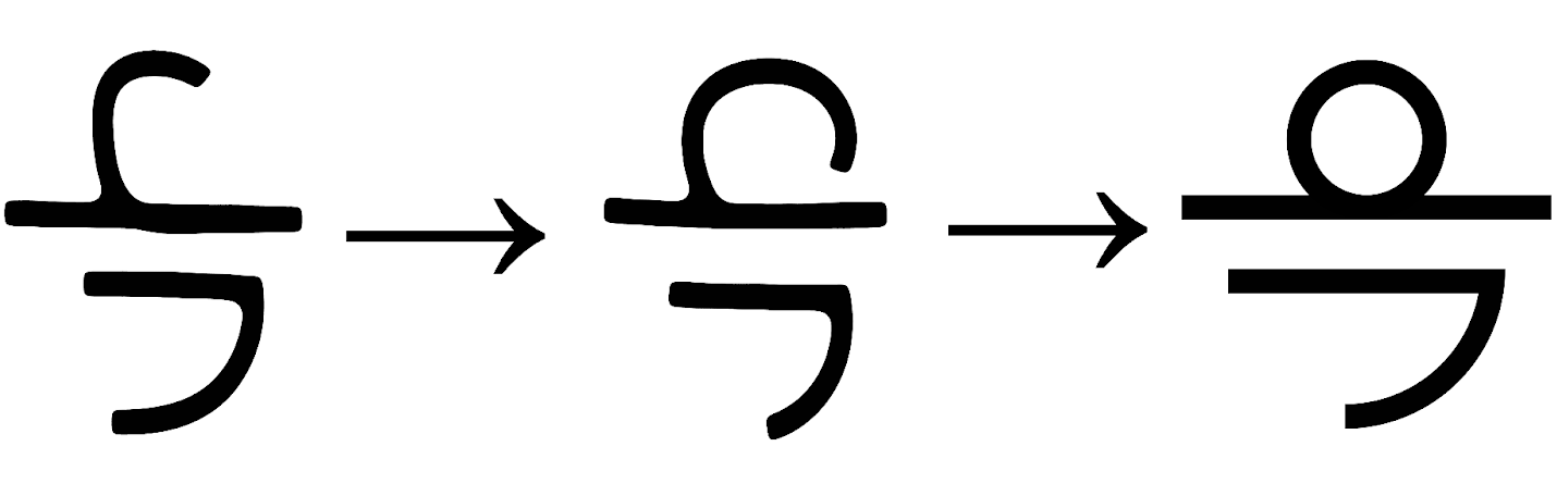
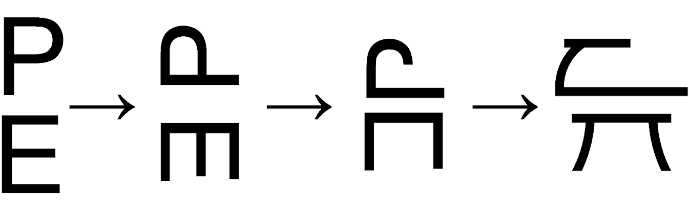
Instead of doing all that work, I had an idea for a shortcut: I would evolve my script from an existing one. I decided to evolve it from the Latin alphabet, the script I’m most familiar with. Evolving your alphabet, alphabetic syllabary, abugida or abjad, from an existing script is a good way to avoid the complexity of making a logography.
To make my script work like an alphabetic syllabary, I tried placing consonants on top of vowels to see how it looked. The result honestly looked very weird, so I tried adjusting each letter, often rotating them, to make the syllable blocks look more feasible. I also made changes so that the consonants and vowels fit together better. It started to look how I wanted, but was still too similar to the Latin alphabet, which I didn’t want.
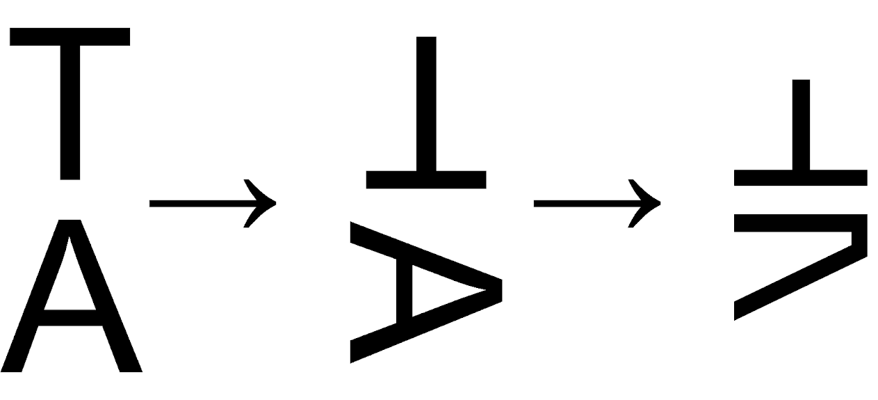
To see how my script would work in a ‘natural’ environment, I moved my efforts from computer to paper, where the script started to take its final shape. Little features and changes that made sense when writing with a pen were incorporated into the script. I also made some changes for purely aesthetic reasons as I refined the script further and further. I moved the design back to the computer and created the final design in Photoshop.
Final version of the Katu script
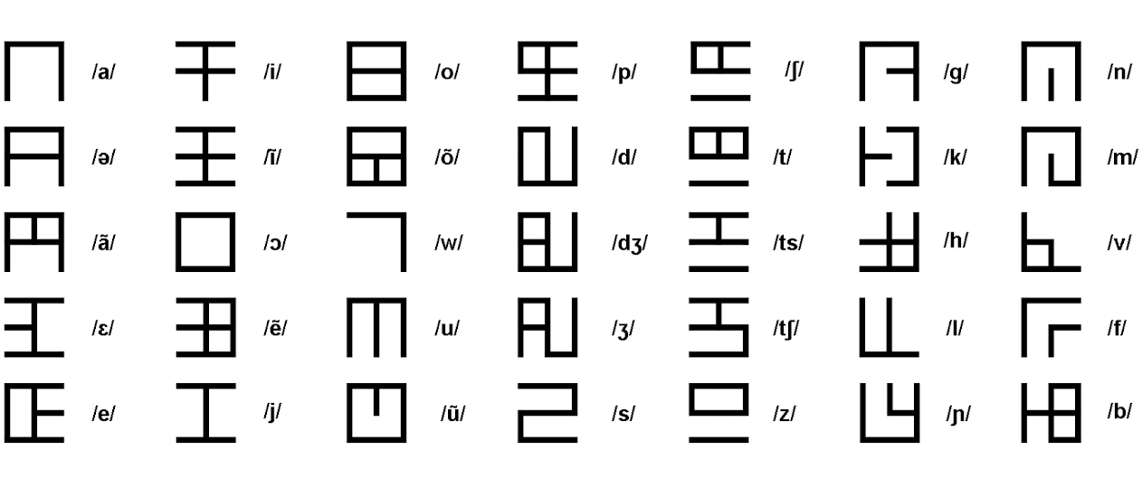
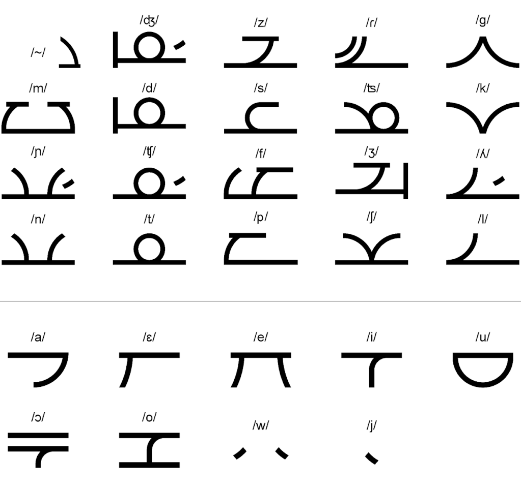
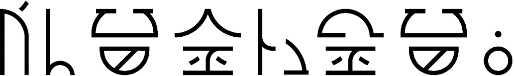
That’s basically the story of how the Katu script came to life. Here is the latest key, showing all of the letters and their respective sounds in IPA:
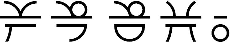
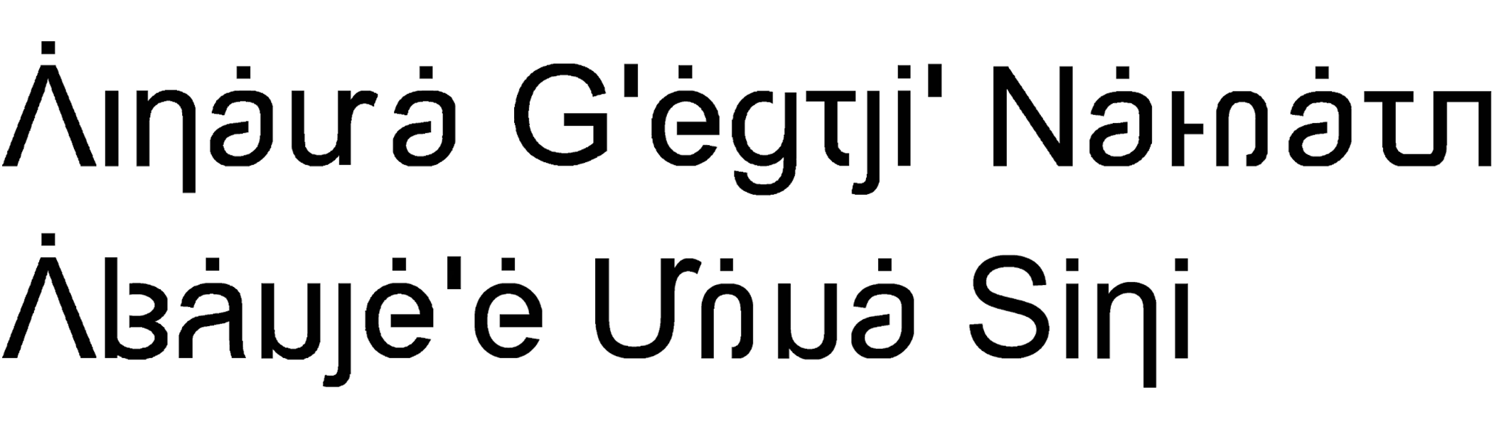
In my opinion, it looks much better in text than in the key. Here are a couple of samples in Lengatu, my conlang, written with the Katu script, for you to see the script in use:
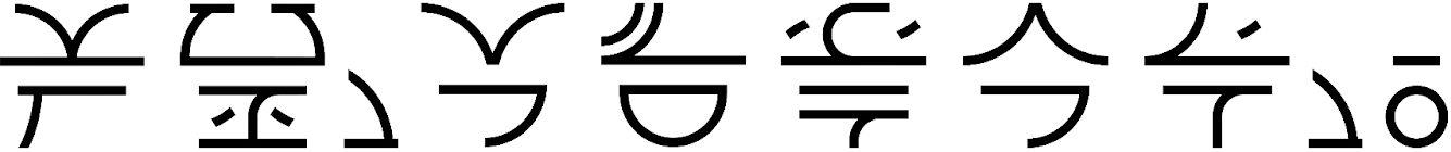
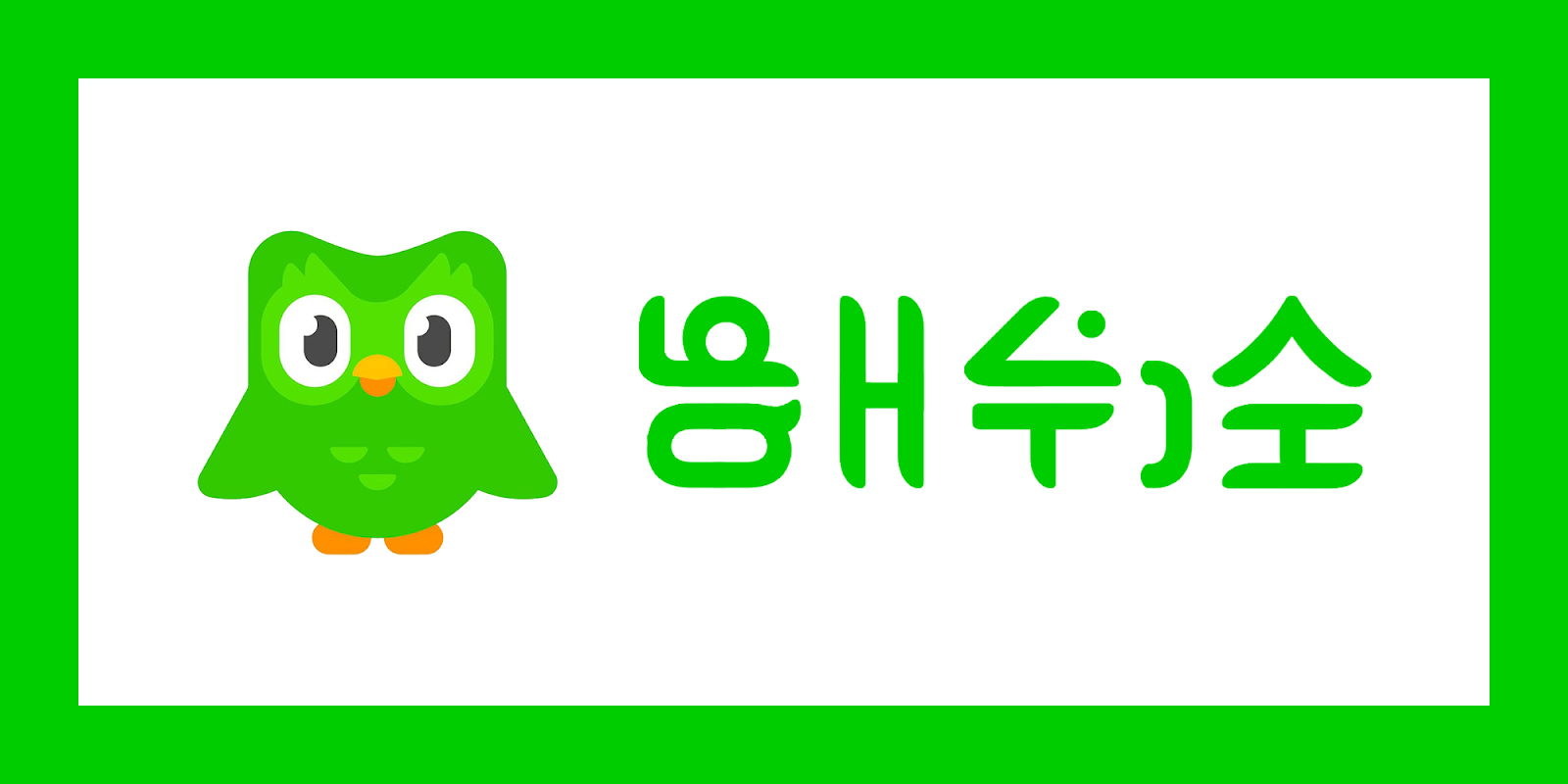
Here’s how Katu looks in the typographical styles of Duolingo and Reddit. With the proper phonological adjustments for Lengatu, /lin/ becomes /ʎĩ/, /ɹʷɛ/ becomes /ɾɛ/, /dɪ/ becomes /d͡ʒi/ and /t/ as a coda becomes /t͡ʃi/.

Katu has even been adapted into a serif font. Here it is on the book covers of Quotations from Chairman Mao Zedong and the Holy Bible in Lengatu, two of the most important (and read) books in history.

Here’s a poster of Avatar: The Last Airbender in a font based on the one used in the actual title. The Nickelodeon logo is also written in Katu, and there are some Chinese characters which featured in the posters in all languages.
Thoughts on the end result
The Katu script still lacks many features that would be useful. For instance, it doesn’t feature a way to end syllables with consonants or make consonant clusters, which in my opinion is a major downside.
Despite that, I have made one crazy attempt to make it suitable for the English language and for codas:
Katu’s lack of flexibility made me realize that I was limiting my conlang development to what the script allowed me. Katu is currently only fit for a very specific type of conlang, which isn’t really the one I want to make.
For that reason, I recently started working on a new alphabet for my conlang, the Abyalan alphabet, which is a true alphabet, not an alphabetic syllabary like before. This one is also inspired by the Latin alphabet, but also other related alphabets like Greek and Cyrillic. Here’s a sneak peek at it:
For Katu, there’s always room for improvement. In the future, if I feel like it, I could fix the things I consider to be problems.
