A dynamic script with a high contrast of character size and sweeping strokes, with the capacity to be adapted to different languages.
About the creator
I have been making scripts and ciphers since childhood. Now I design scripts on commission and my dream is to develop resources for Language Minority groups who don’t want to be sidelined into using the writing system of a local trade language.
You can find me on the Neography subreddit as FantasticalScripts, or see the rest of my work at ConOrthography on Instagram. I had the pleasure of writing a blog post about Neography and Worldbuilding for The Fantasy Hive. A comprehensive video walkthrough of my process is on the Language Creation Society YouTube channel, called Techniques for Script Development.
I design scripts regularly as one of my creative outlets. All I know about this one going into it is that I want something graceful and complex, and something that is beautiful to look at. That’s not an original design goal, either for me or in general, so I know that I will have to make my characters with interesting shapes to avoid recreating other scripts I’ve made. I design with traditional media, usually pens and brushes, and I am particularly fond of sweeping strokes so I hope to include lots of those. They’re very satisfying to draw and they can add nice dynamic motion to your work.
This script is not being made for a specific language, I just want to develop a system for writing that looks good and I can choose to adapt it to future projects if I want. It’s easiest for me to make an alphabet or at least a faux alphabet initially so I can use it as a cipher and write out text samples in English. It’s also not a pinnacle of the perfect creation process. Creativity is messy, and I want you to experience some of that and navigate it with me. I hope it helps you learn to navigate your own creative journeys!
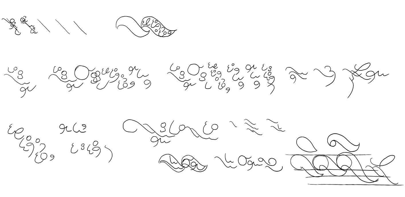
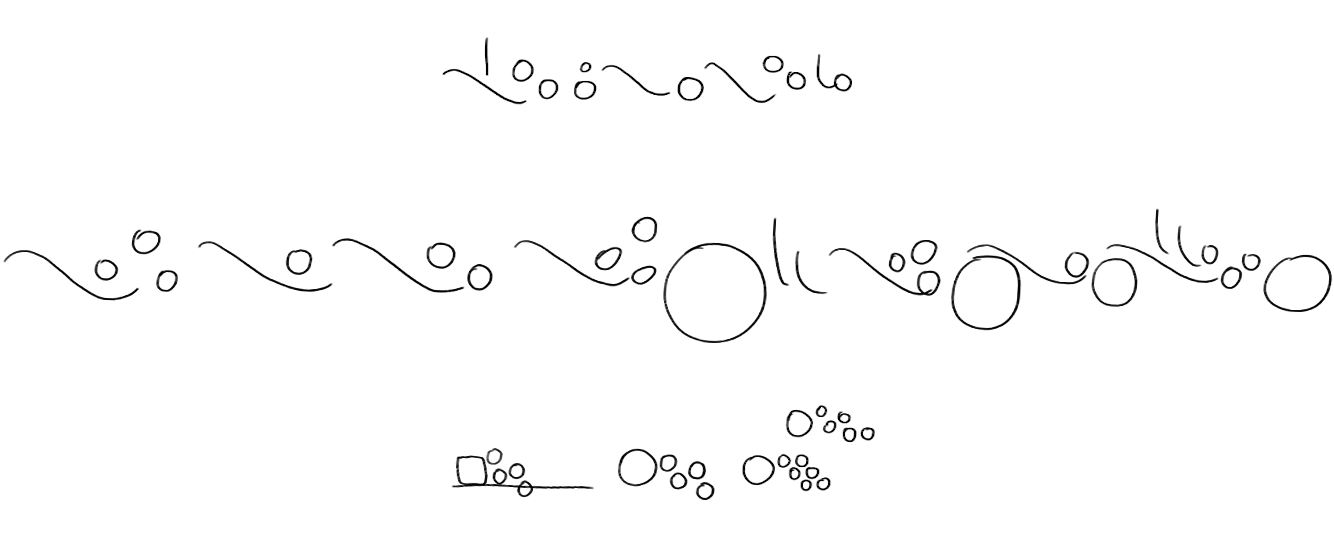
Script sketch
I almost always start with a script sketch, it’s an important part of the process for me when I have a feeling for what I want the script to be like. The key to this kind of sketch is that you’re feeling your way through the shapes and overall look of the writing. I want to draw out my ideas without my conscious brain critiquing along the way, so I draw fast with a loose grip and make whatever pencil lines feel the most expressive. Don’t worry about how those shapes will fit your language. Focus on the moment.
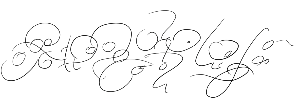
Now that I have my base idea to work with, I will do a more specific version of the sketch where I’ll draw it again using shapes I like from the original. There are a few subtle changes here that I want to make already, and they will impact the rest of my character design. The initial sketch leans to the right, like ⟨/⟩. I’m going to be working with a calligraphy pen and left leaning lines will be the more graceful looking choice. The second version will have a lot of ⟨\⟩ lines.
Even redrawing it with similar shapes, this looks a lot different already! Now that I have two sketch references to work from, I will pull a bunch of the shapes I like and draw them in different versions to make the base characters of my alphabet.
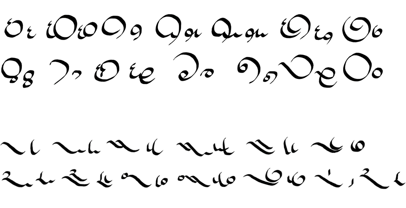
Organizing by shape
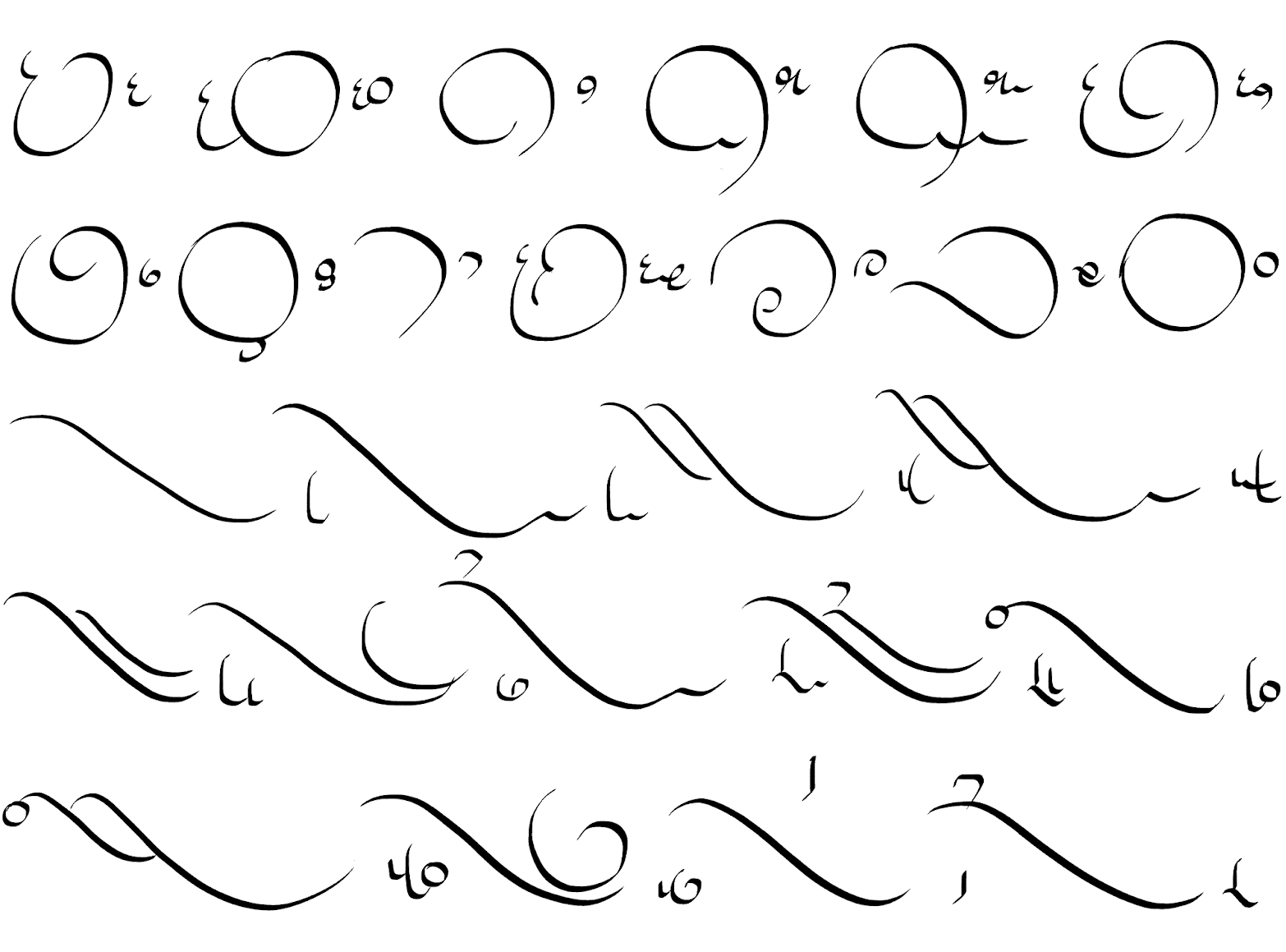
Now I take all the characters I like and generally organize them by shape. I choose the characters that I think best represent the sketch I made, rather than the shapes that I think look best by themselves. Your characters will very rarely be used in isolation and it’s surprising how much the overall look of a script is affected by the choices you make in this step!
This gives me a lot of information about what I’m working with. I can start to make choices like which shapes should be assigned to vowels? Which kinds of shapes need to be common, and which ones should be a rare occurrence?
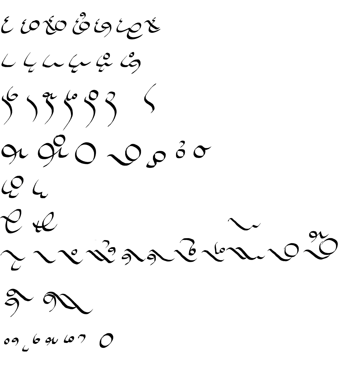
Now that I’ve put them into groups, I’ll use this as inspiration to create a few more characters.
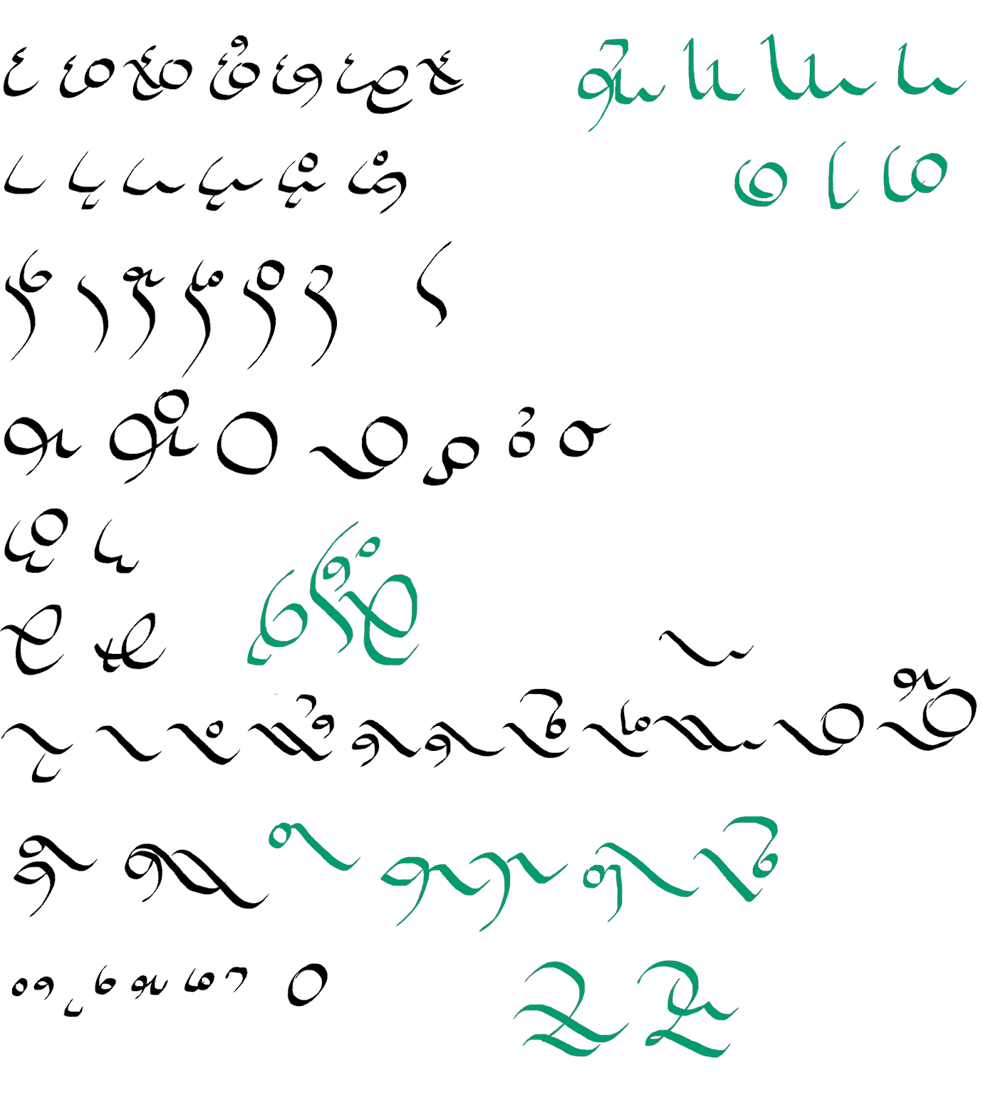
Now I have a LOT of shapes and some of them are very different from each other. That can be just fine, sometimes you want contrasting shapes that will add interest to your script. At this point in testing though, I don’t think the end result looks cohesive. It might be that I have too many things happening at once and I need to simplify.
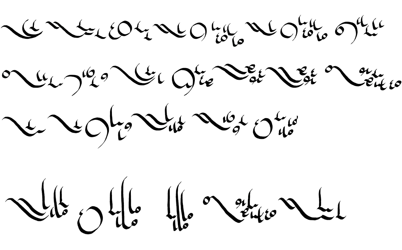
It gets worse before it gets better
I will divide this into two sets of characters and see which one I like better. It seems to me that I can use the vague categories of ‘roundish characters’ and ‘flat or angled characters’ so I’ll separate them that way.
These are the two separated character sets, with a few characters added as I felt necessary. The lower one, the ‘angled characters’, seem to be developing modifiers that rest on top of the basic shape.
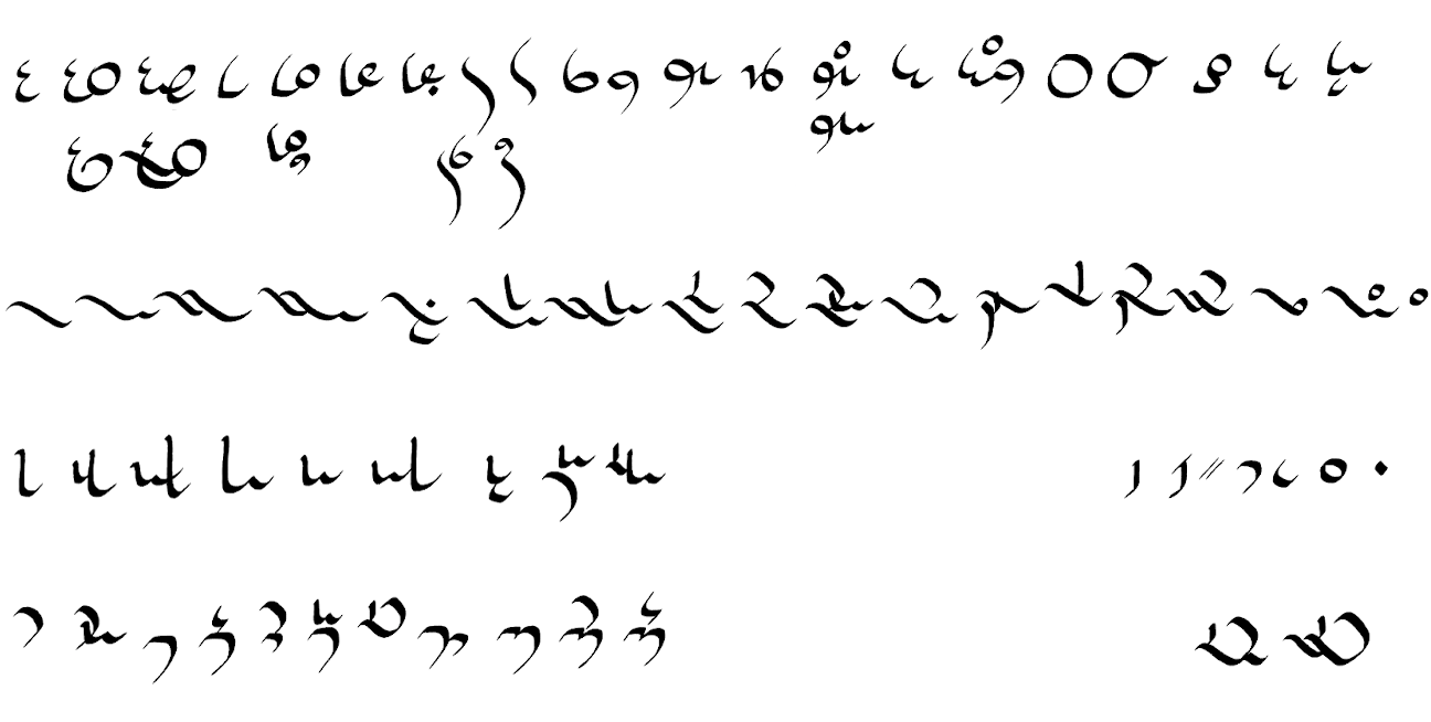
Here are the two character sets simplified again into their more basic components.
After practicing with both, I have these two different scripts.
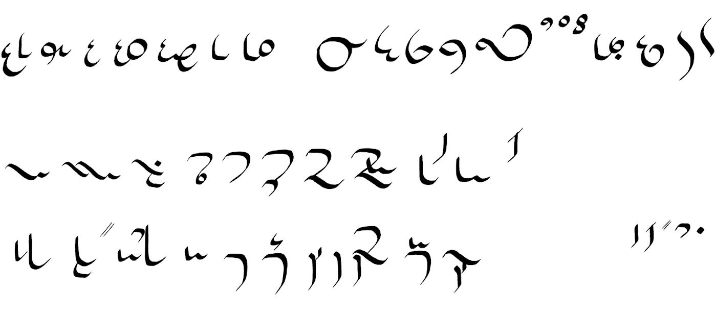
At this point I feel that both have lost the spark that made the original one interesting to me, so I decide to mash them back together so I get the best of both. It might feel like a fruitless exercise, to have divided them and then changed my mind about it, but I think I have ended up with different symbols than I originally had to work with so in the end everything is progress.
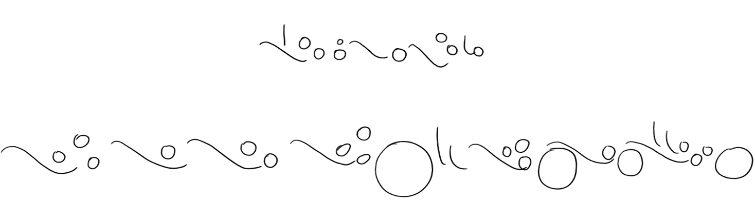
With that progress in mind, I will bring back the large set of characters,
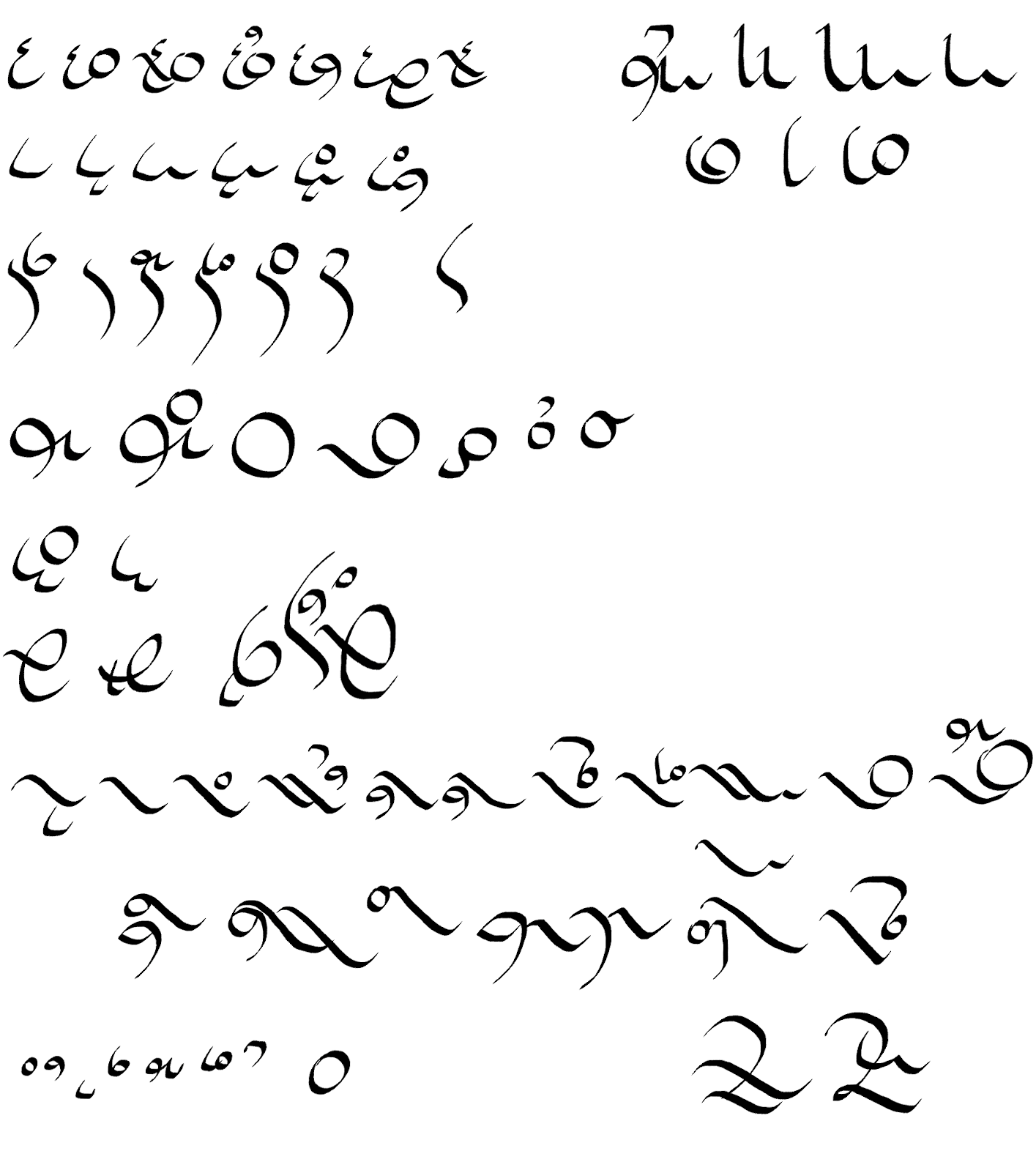
and just draw out everything that sparks my interest rather than go straight to testing it as an alphabet.
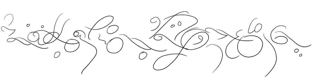
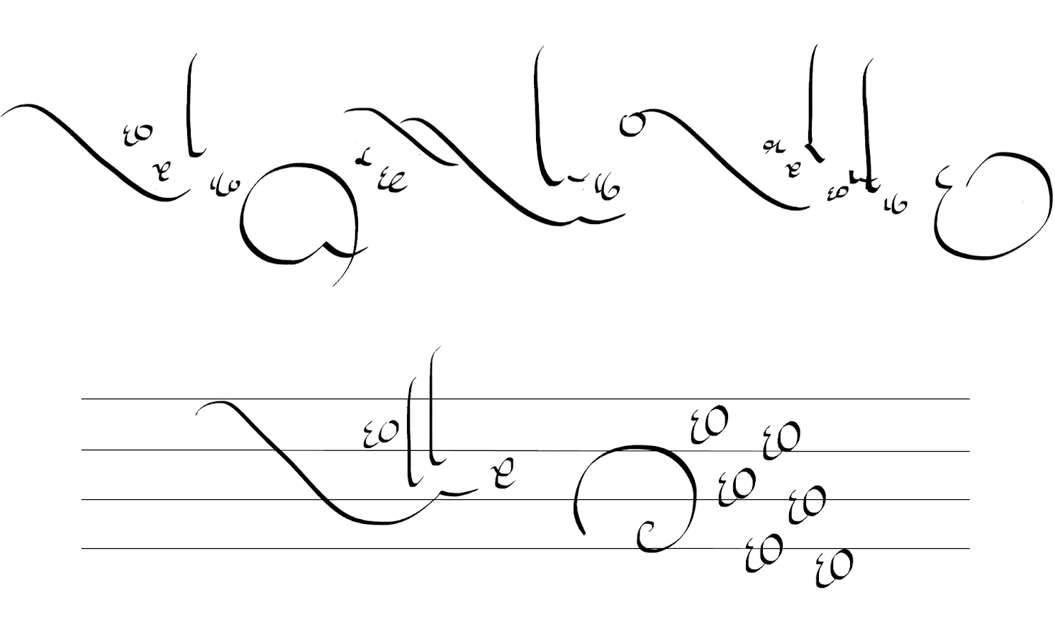
Making More Sketches
As I’m testing out putting my new shapes together, I also notice that I like a certain ebb and flow with lots of height differences. It gives the impression of something organic when it feels less standardized. So how do I standardize it so I can use it without making it look standardized? I start experimenting with different silhouettes to fit my characters into. At this point if I wanted I could decide to lock this in as an alphabetic syllabary or maybe as an abugida so that my character clusters are big enough to ensure that kind of silhouette.
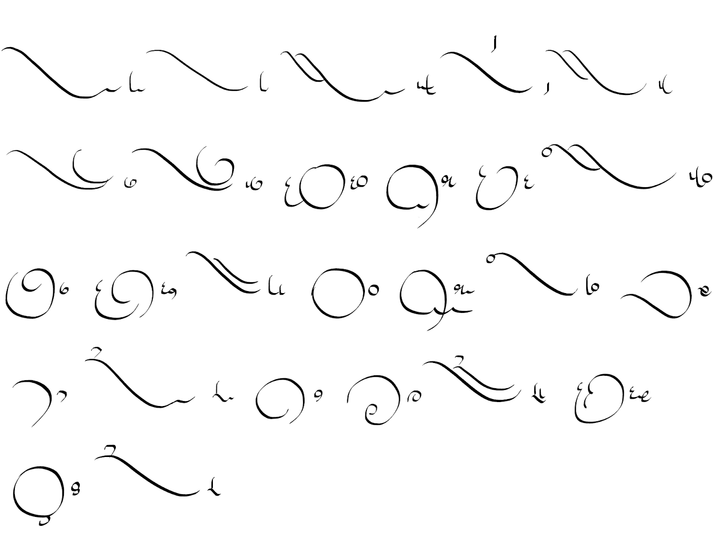
After more experiments, I decide once again on a left leaning flow ⟨\⟩ for the character clusters. I also try different ways to fit my shapes into the silhouettes.
Again with my calligraphy pen.
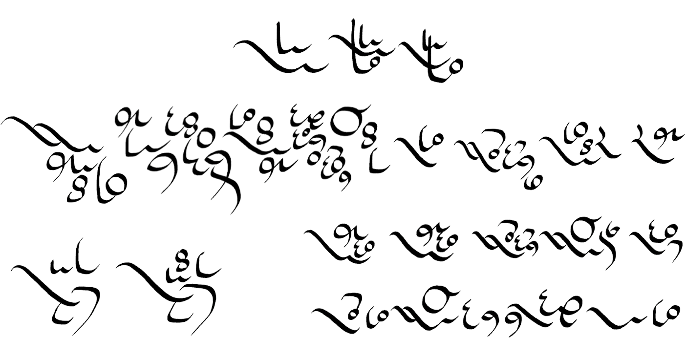
Part of keeping things organic is making sure that everything isn’t the same size. So I divide my set by shape AGAIN to see which ones I want to be big or small.
This is when I have the epiphany that there are four basic shapes I want to use ⟨\, |, 6, ◯⟩ and that I only want to use two of them to start every cluster with ⟨\, ◯⟩.
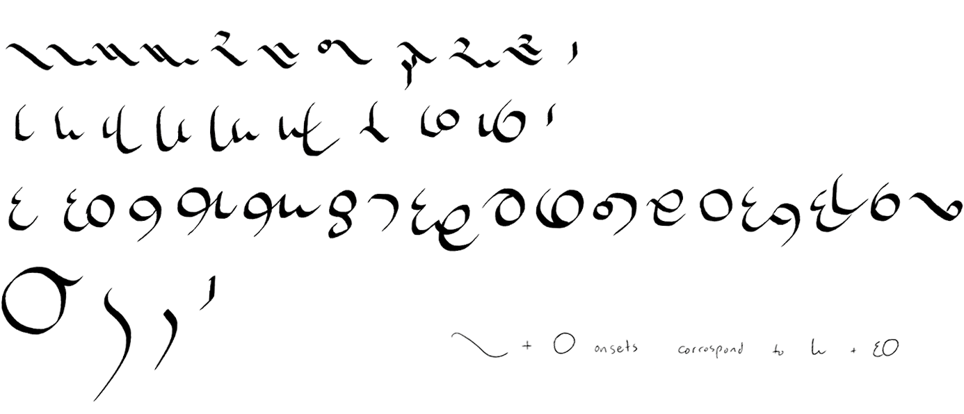
Finally Finding the Magic
So I decide that each letter of my alphabet will have two characters: one that will be used to start a word or syllable, and one that will be used if it’s in the middle. It Will Be Like If I Start Every Word In My Sentence With A Capital Letter Like This.
I lay out a proof of concept with some examples of how I want to order things, and where the middle characters should go depending on how many of them there are.
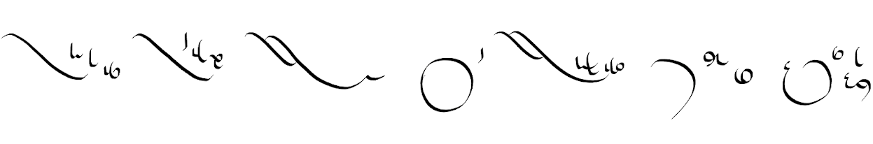
Next I get to work adapting each character with their pair.
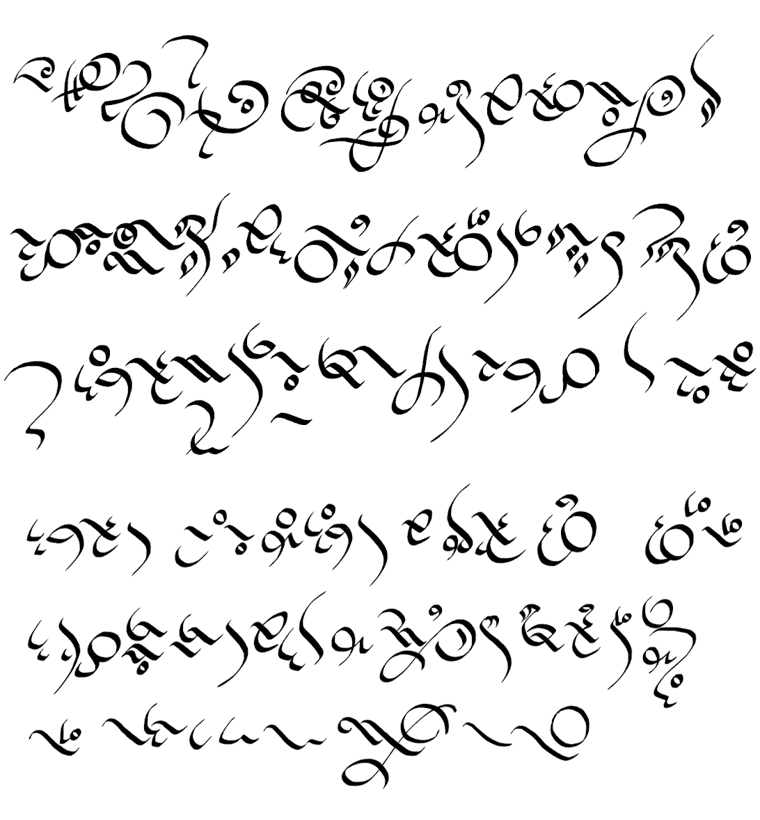
This is now the character set I want to polish up. Individual characters may get tweaking, or I may need to add more pairs in the same ⟨◯⟩ or ⟨\⟩ style if the script is adapted to a writing system that needs more characters. But this is very close to a final version.
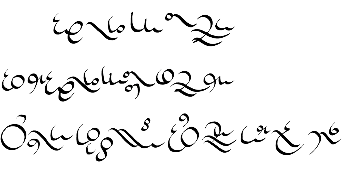
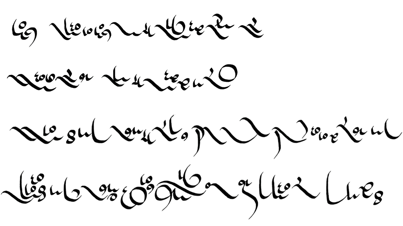
Here is my initial test run through the new system.
It’s at this point that choosing proportions, and which letter gets what sound, makes a huge difference to what your end result looks like. I want to make adjustments to how the letters sit in the text, and I will also assign my characters so that different ones are used more often than what shows up in this sample.
Final Adjustments
I want an airy look for this script, so the first change I’m going to make is to adjust the line weight so it’s lighter. I’m also dropping the round capital letters to sit on a lower baseline than the ⟨\⟩ letters.
It’s now a proper set of characters ready to be assigned to letters or sounds.
Now that I’ve got all my characters the way I want them, I have to think about how I want to use them. For now, I’ll assign them to our English alphabet so I can see what it looks like when written. In my case, that’s just for testing purposes. I’ll be able to adapt this to an Alphabet or Alphasyllabary or Semisyllabary, so I don’t need to have exactly 26 characters to correspond with our alphabet. All I need to do is order them based on how often I want them to be used.
I will order them most to least frequent, with over half of the ⟨\⟩ characters taking the most common slots. I want the round characters to be an accent shape that shows up less commonly, so my text looks like the shape sketch:
Here is the frequency order I’ve chosen. The English alphabet frequency list I applied to it follows this order: e t a i n o s n r d l u c m f w y g p b v k q j x z
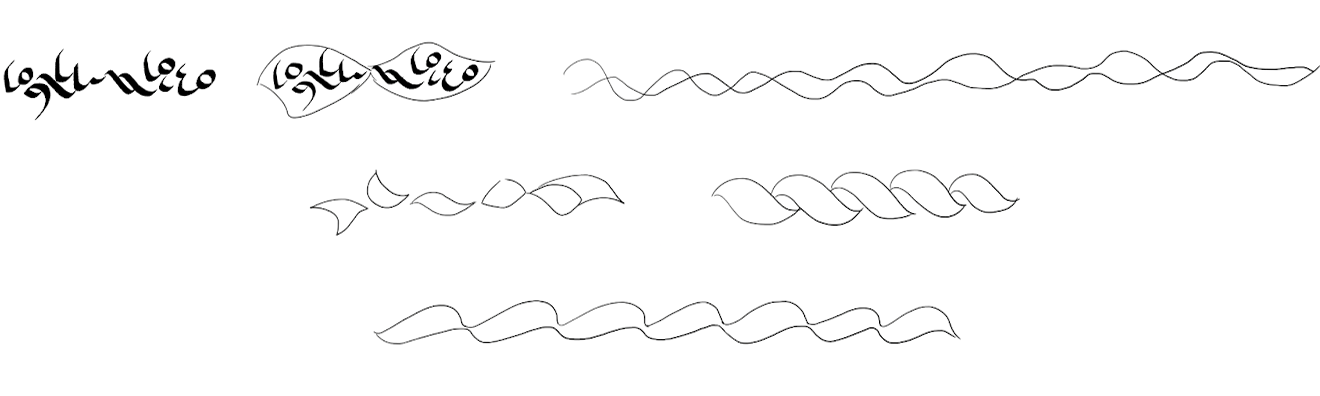
Here is a sample that says ‘testing a final product’. Ideally I want clusters of lowercase letters to be around 1‑4 letters, so for English it works well by starting a new unit every syllable. The sample really reads more like ‘Tes(t)Ting A FiNal ProDuct’.
That’s still a little flat. To add more visual interest, the lowercase ⟨\⟩ letters will be extended into tall stems. These ascenders become the highest points of the text. You can see how they contribute to a more dynamic visual ebb and flow.
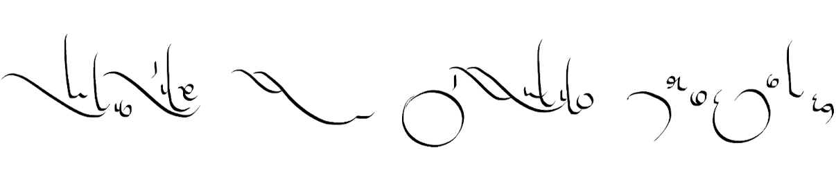
(If you’re paying close attention, you may notice I mixed up the last two letters so that’s why the t looks weird.)
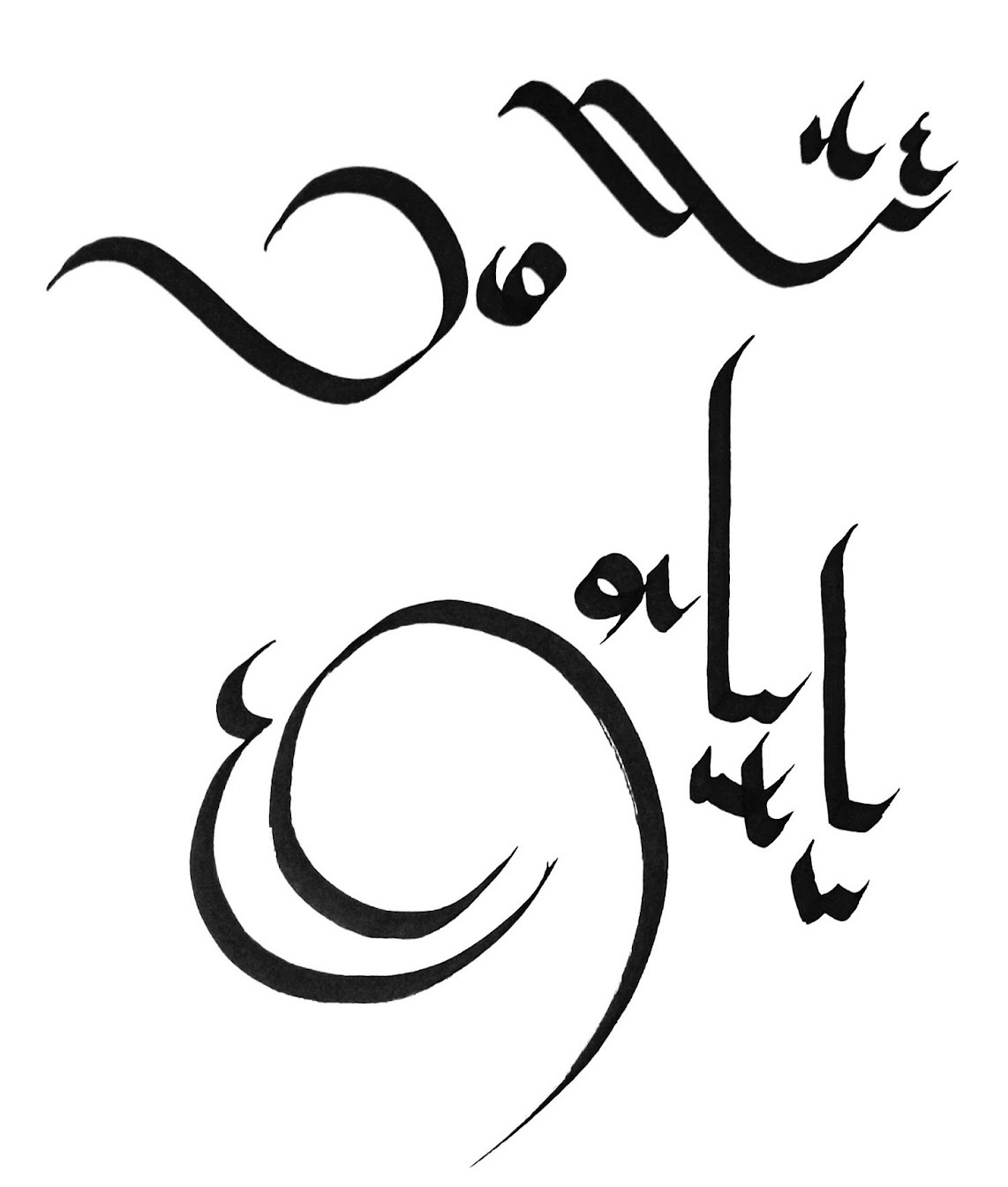
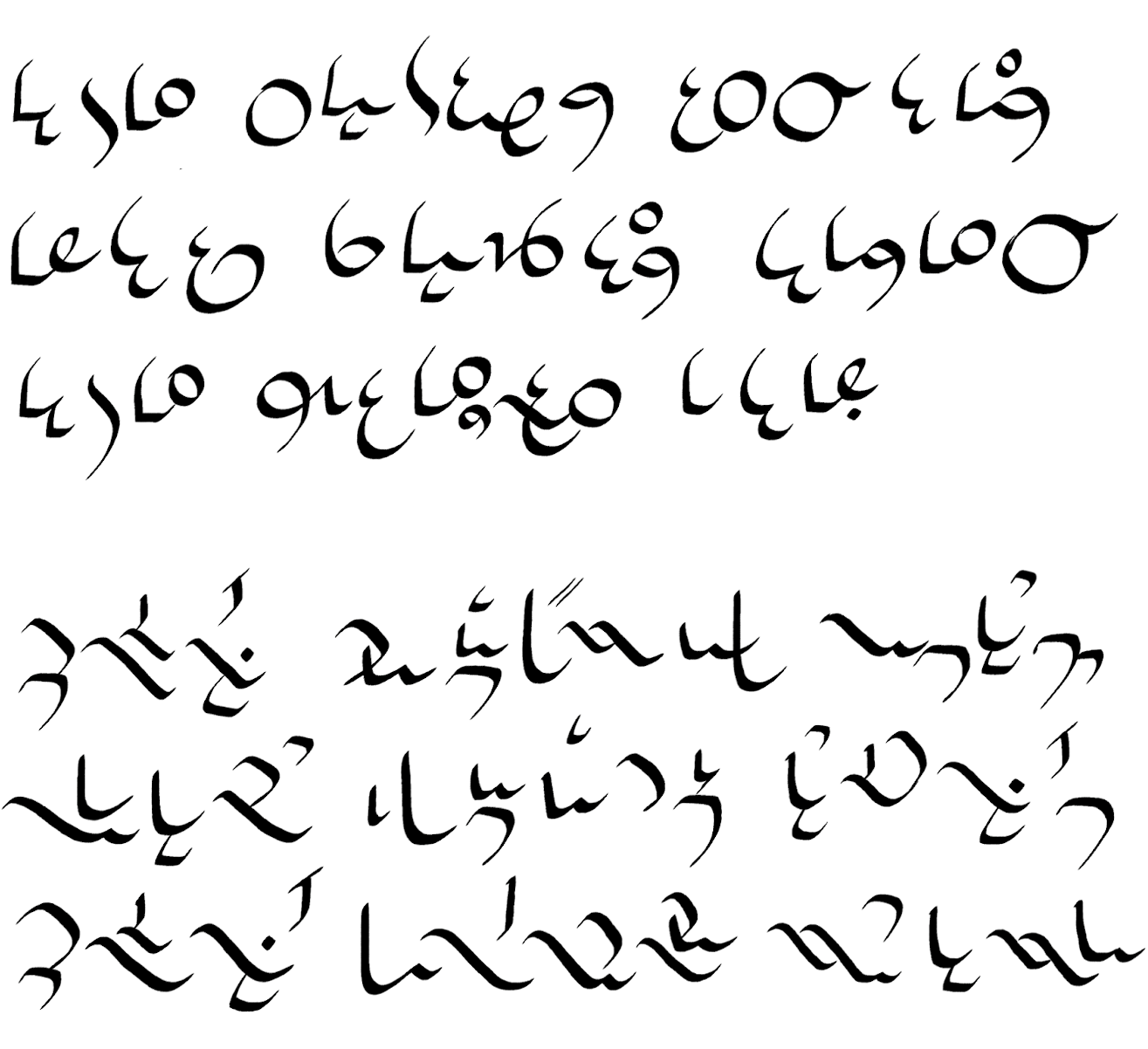
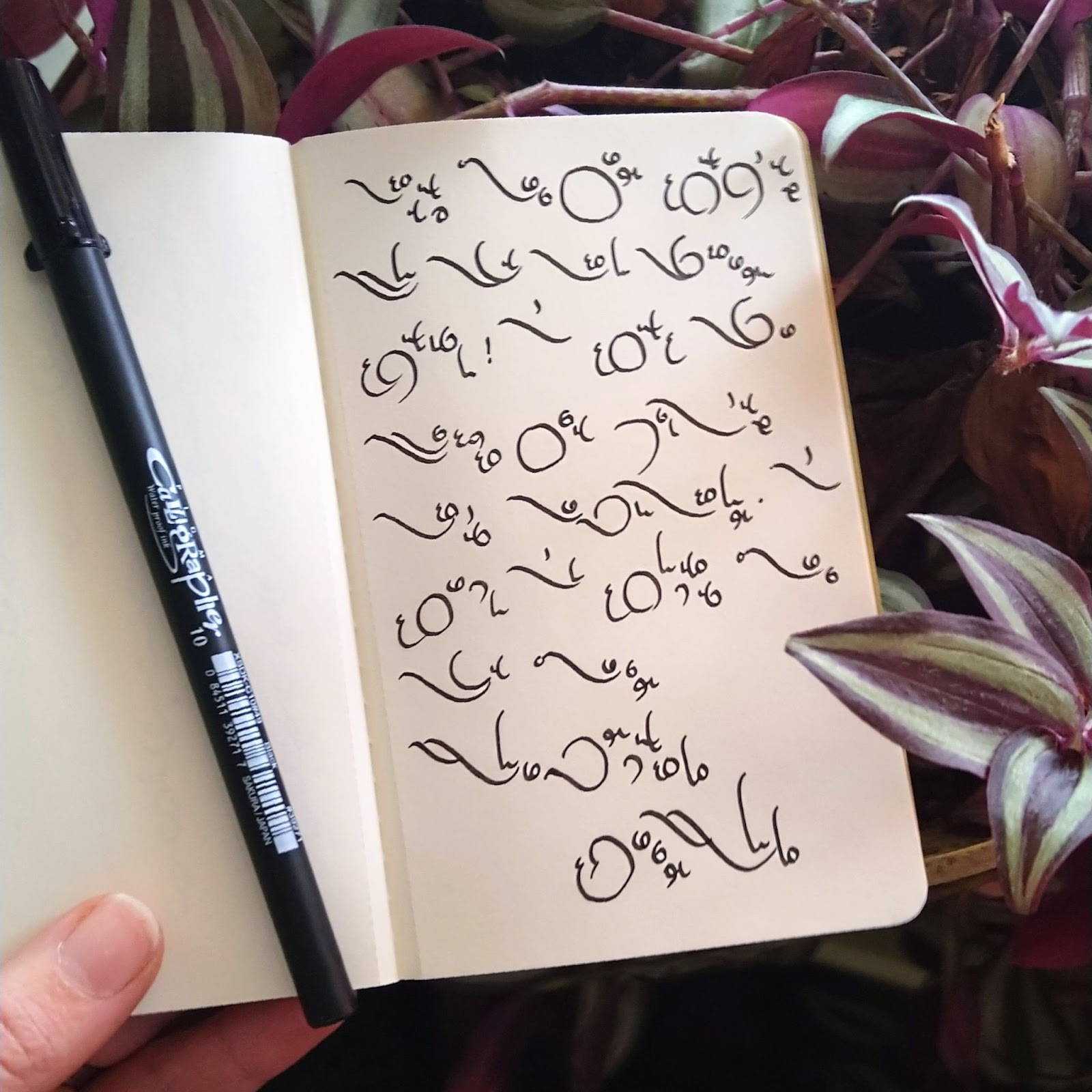
Here’s a longer sample done in its intended medium!
Comparing what I made in the end with the first sketch I did,
it looks very different. To me that’s one of the cool things about the initial sketch. I get to see how my ideas evolved, and I can also keep it to see what other scripts it inspires. The same sketch can be extrapolated into totally different looking things!
Using the same starting point next time, I’ll see what medium looks good with a forward facing slant and I will incorporate more overlapping elements. Maybe combined with more open sweeps and circles, I’ll achieve a light-as-air script.
Until then, go and create!