Making a writing system is easier than it seems. This guide shows you the basic steps of creating a script, and demonstrates by creating one along the way.
Step 1 Decide how it works
1.1 Type of characters
1.2 Character set
1.3 Writing direction
Step 2 Design the characters
2.1 Aesthetic goal
2.2 Evolution method
2.3 Graphical method
Step 3 Refine
3.1 Cohesiveness
3.2 Alignment
3.3 Typography and calligraphy
A longer supplemental guide is available if you want to go on a deep dive. Thanks again to CBB forum user Clawgrip, whose original guide served as the basis for this.
Step 1: Decide how it works
What’s your goal for creating a script? Secret notes, fictional languages, artistic design, or something else? Knowing your goal is important for the creative choices you make during this process.
This guide suggests many options, but you can always think outside the box about even more possibilities. But there’s no pressure to get too fancy; even a simple left-to-right cipher can be unique and beautiful.
1.1 Type of characters
How will your script represent language? Do characters represent the sounds of speech, or the meanings of words, or a mix of both?
There are four types of characters, broadly speaking, with various ways to mix or arrange them. It’s best to follow the example of a type of writing system you know, but you can also experiment.

Consonants
Characters for sounds produced by varying constrictions of the vocal tract.
Vowels
Characters for high-sonority sounds. Usually the core of a syllable.

Syllabograms
Characters that represent at least one consonant and one vowel. Commonly one consonant then one vowel.

Logograms
Characters that represent words or word segments. Writing is compact, but has more complex and numerous characters.
1.2 Character set
How many characters will your script have? What does each character represent? Figure that out and make a list or table to keep track of the characters you need to create.
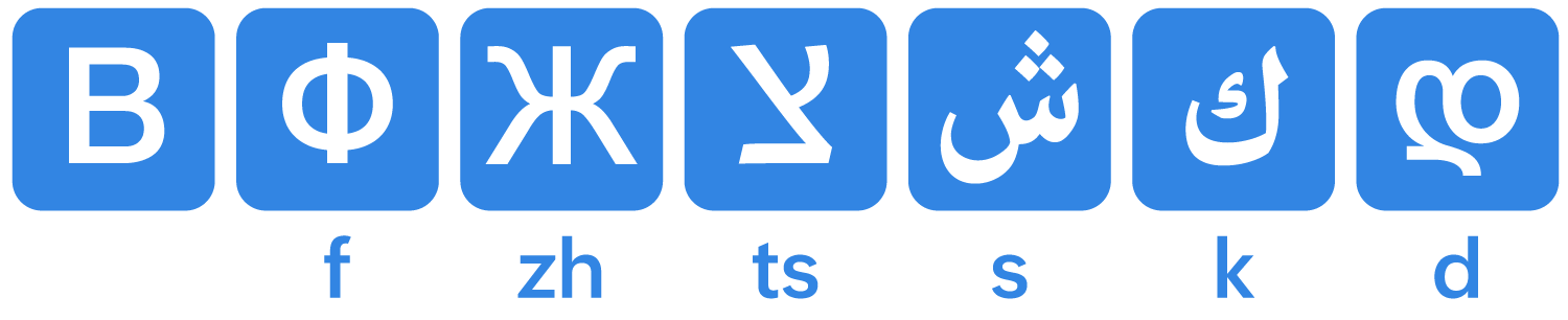
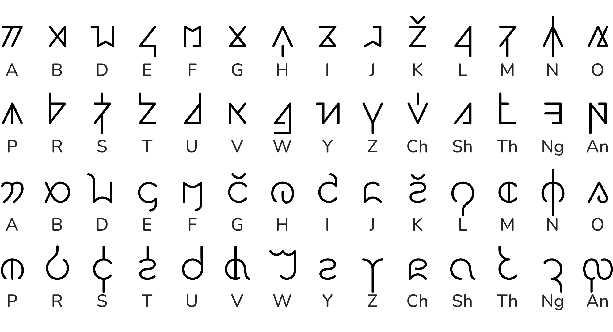
To demonstrate how to create a script, we’ll keep it simple with a cipher: one character substitutes each letter of the English alphabet. Since we’re not phonetically reconstructing English, spelling is mostly the same.
| A | B | D | E | F | G | H |
| I | J | K | L | M | N | O |
| P | R | S | T | U | V | W |
| Y | Z | Ch | Sh | Th | Ng | An |
But we added a few twists. We removed the letters C, Q, X, which we’ll instead write as K or S, KW, KS respectively. We also added four new letters to represent CH, SH, TH, NG, and one random syllabogram for AN.
You don’t necessarily need capital and lowercase versions of each, unless you want to double the work. Numbers and punctuation are also optional.
1.3 Writing direction
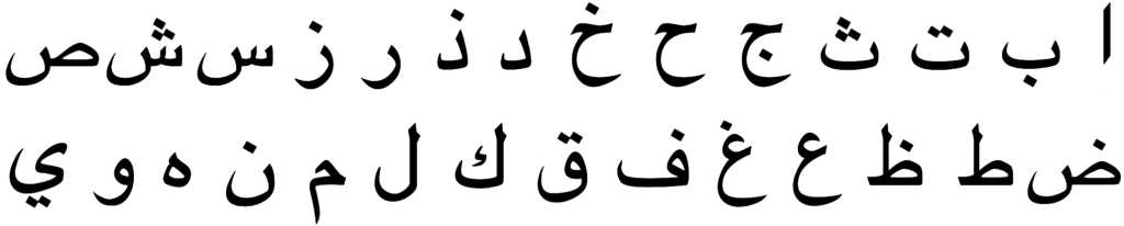
Writing direction affects how characters fit together, so you should decide this before designing the characters. This includes the direction of single lines of text, as well as how those lines are arranged. Writing directions used by real-world scripts are shown below.
This doesn’t count diacritics: vowels or other modifiers added above, below, or inside letters. You can experiment with other direction possibilities, but we recommend beginners pick a simple option from the top row.
Step 2: Design the characters
There are two big difficulties when creating characters for a script. One is making them look harmonious together. The other is making them at all: a blank page and endless possibilities can be quite intimidating.
It’s very difficult to invent good-looking characters by simply trying to think of interesting shapes. Fortunately, we have great methods to tackle these challenges.
2.1 Aesthetic goal
It helps to choose a look and feel to work toward, even if your goal changes by the time you finish. Browse the scripts below or search the web for reference images. You can pick more than one and combine elements you like. It doesn’t even have to be a script; it could be any visual pattern.


Another approach is to draw an asemic draft: meaningless text-like sketches in your desired style. Asemic writing can be a great starting point. If it’s good enough, you can even start assigning shapes to characters based on how common you want them to be. It might take some trial and error to get real letter sequences to match the character sequences that look good.
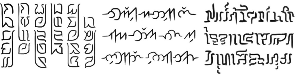
The script on the left was inspired by falling leaves, with a stem that groups letters by word like Devanagari. The middle script was inspired by clouds drifting between mountain peaks, with letters connected like Arabic. The script on the right was inspired by aquatic lifeforms like corals, kelp, and squid.
2.2 Evolution method
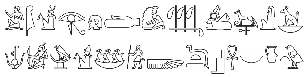
This step is optional. If you can get by with references, asemic drafts, and the graphical method, you should probably skip this due to the extra effort. But if you’re having difficulty thinking of letter shapes at all, it helps to mimic history. Most of the world’s writing systems originate from pictograms:

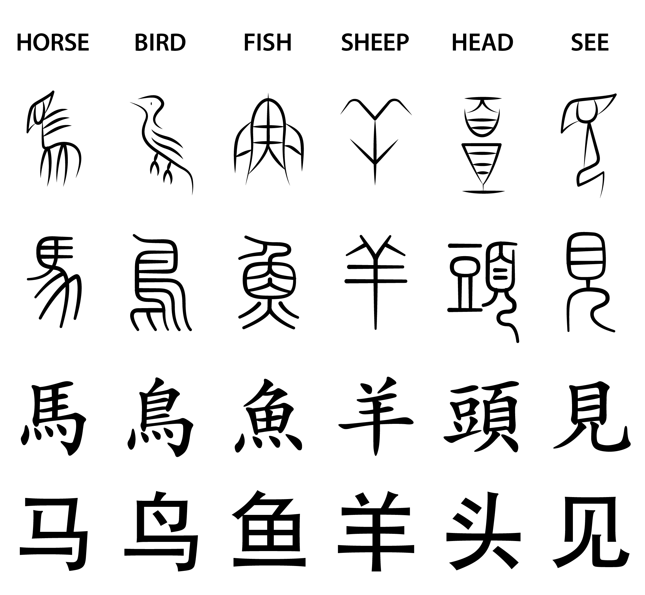
You can assign an object to each character in your script, then simplify it until it becomes a good abstract symbol. Google image search your assigned words with “symbol” or “icon” to find clear visual ideas.
Lets start our demo script. We picked objects that match the sounds, but you can assign anything. Try different ways to simplify each pictogram. For the sake of clarity, only three iterations are shown here. Many alternative ideas and in-between steps were omitted.

Pictograms are starting points, not end goals. You can rotate, flip, or chop up pictograms to make letters, even if the original pictograms become unrecognizable. Or toss them away if better ideas happen to spring up.
2.3 Graphical method
Writing systems tend to reuse a few shapes repeatedly among their characters. Not because a designer planned it, but imposed by physical limitations of writing materials and practicality.
Here’s a breakdown of the basic strokes—the building blocks of characters—in two scripts: lowercase letters of the Roman alphabet in Copperplate calligraphy, and Chinese characters. Although some characters have blended or unique stroke types, it’s remarkable how far such a small set goes.

To figure out good basic strokes or shapes for your own script, pick quick and convenient motions. Fewer is better, so find a versatile variety with simple but contrasting geometry. Also study your aesthetic goal: which repeated strokes and shapes give your references their distinct appearance?
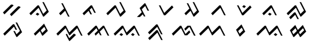
This script was inspired by a combination of Devanagari, Hiragana, and floral patterns. Its basic strokes are loops and a petal-shaped wedge that comes in several recurring positions and orientations, as well as V and X‑like shapes.
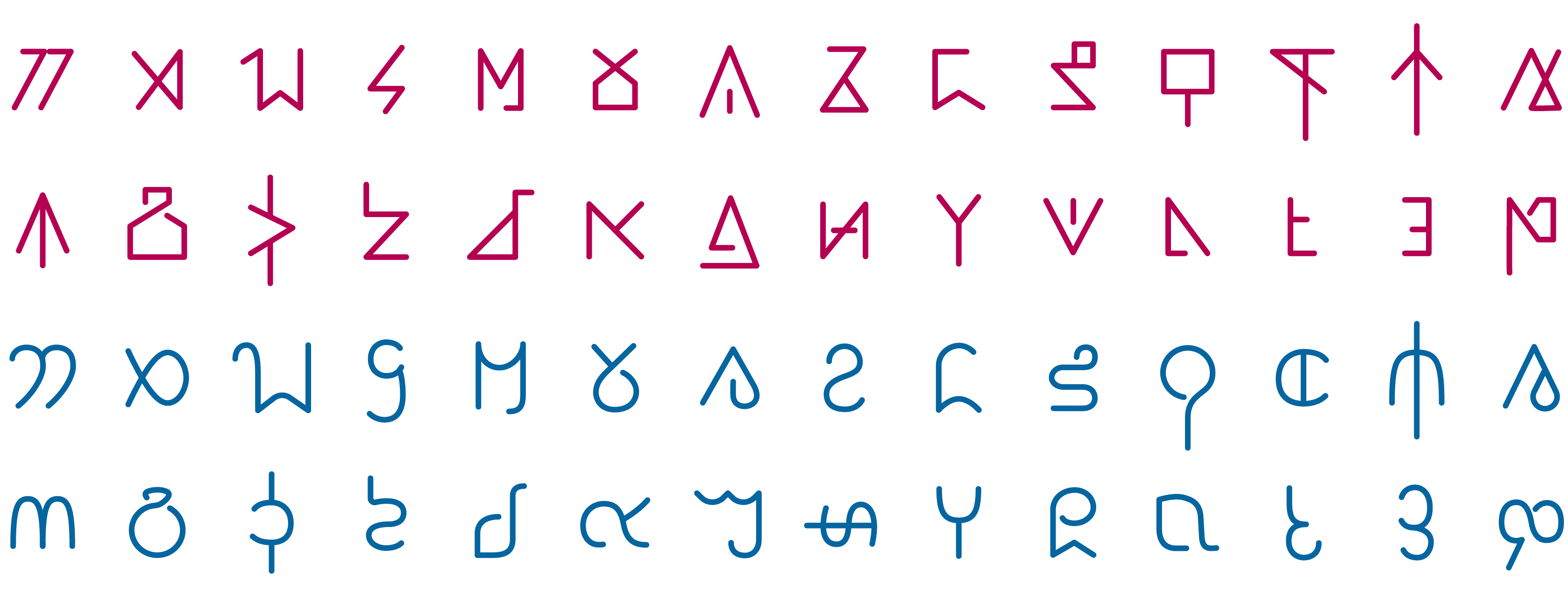
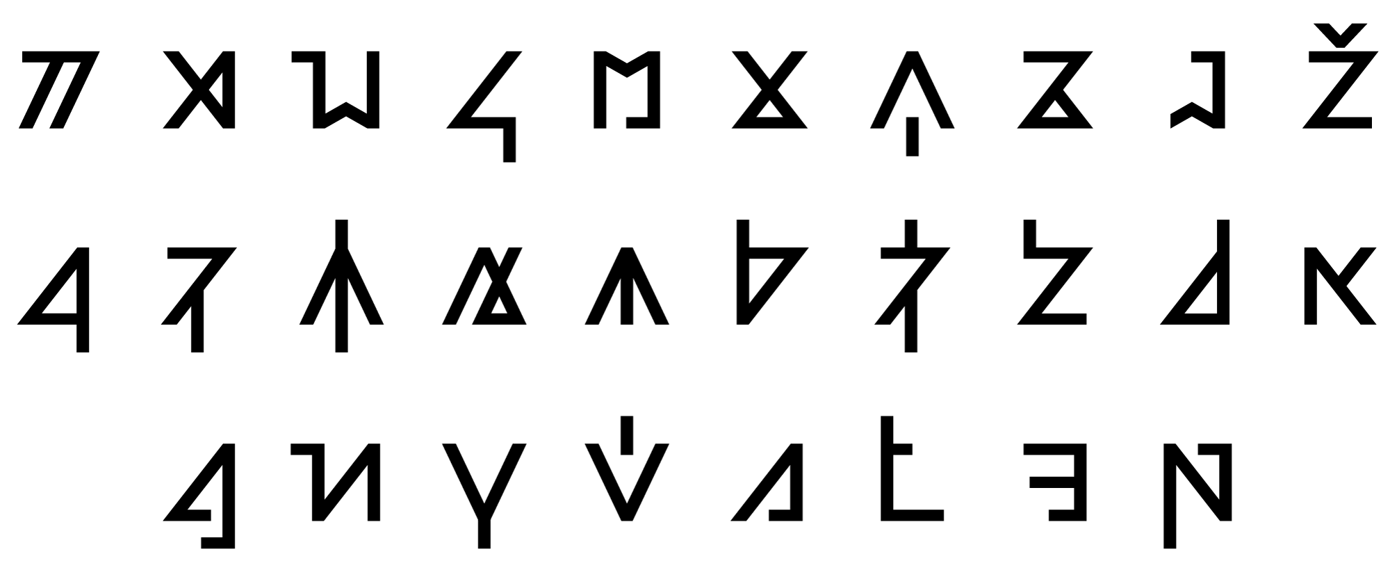
When we evolved our demo script characters from pictograms, we skipped the aesthetic goal step. As a result, it’s a graphically incoherent mismatch of styles:

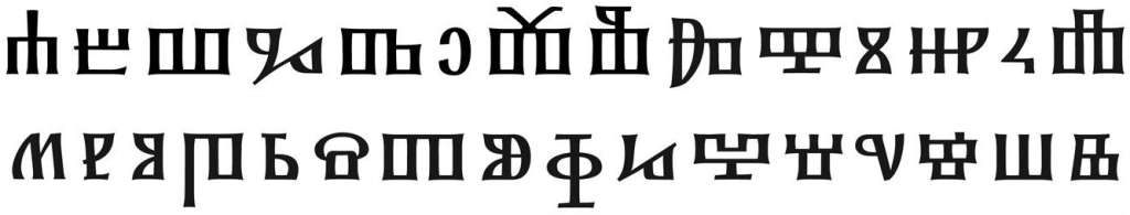
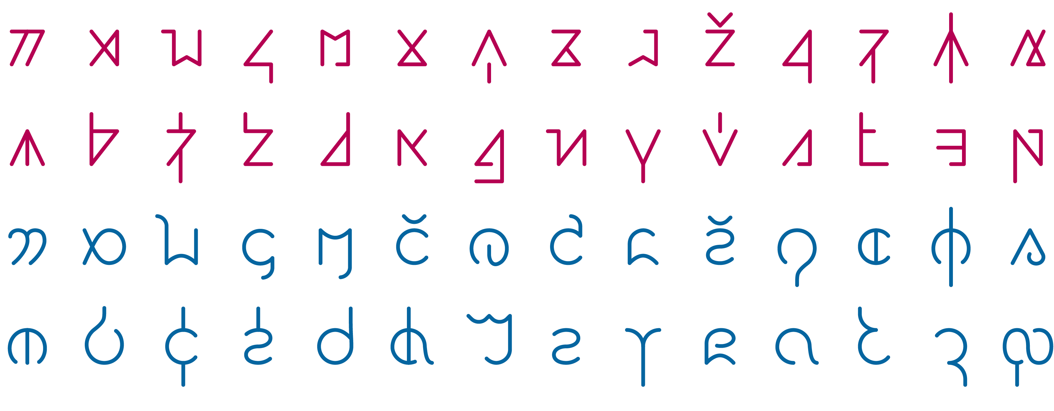
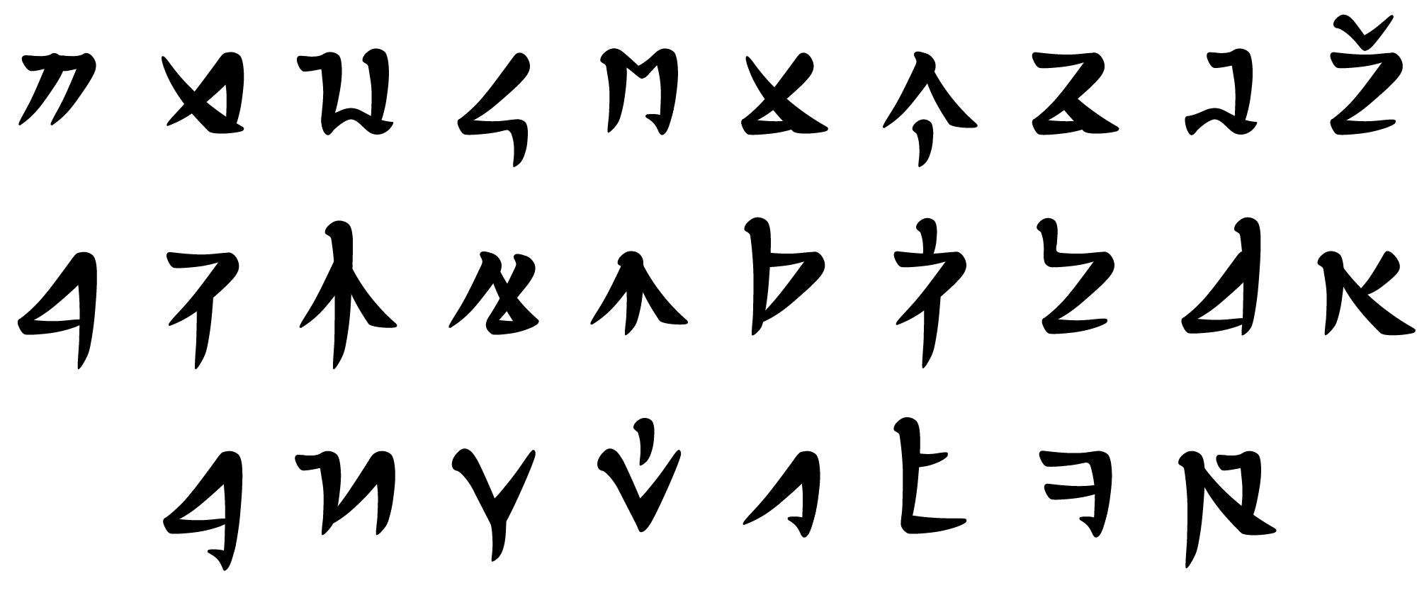
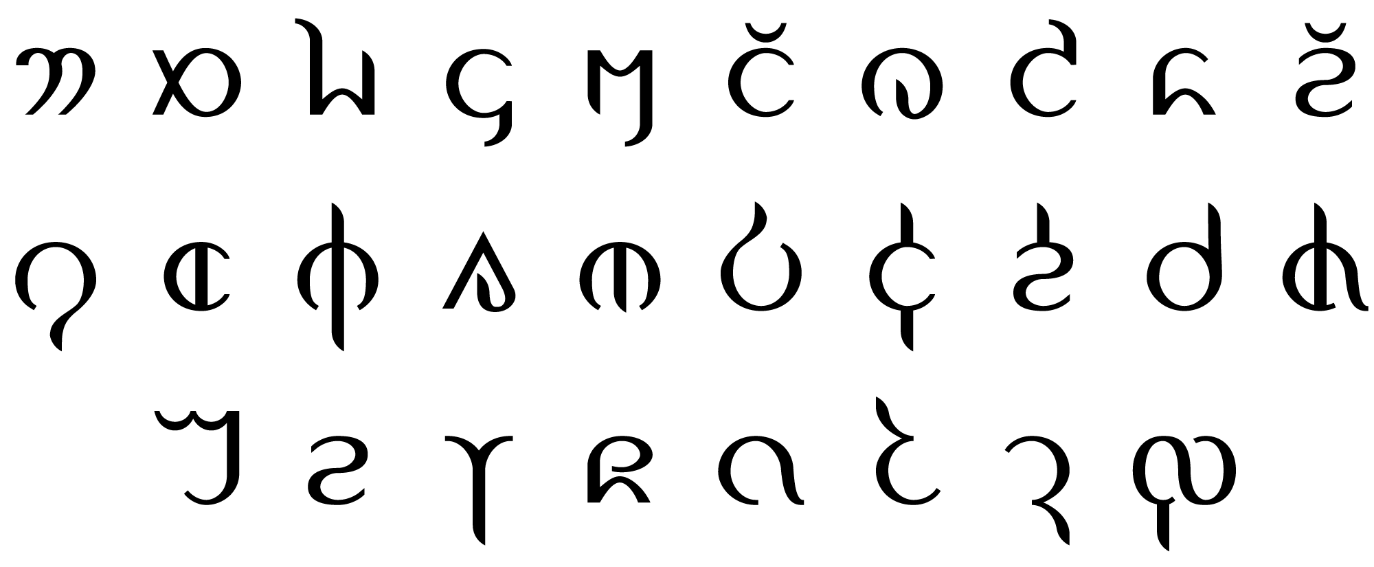
Let’s fix this by applying a more consistent graphical style. To show how your creative choices during this process can lead to very different results, we’ll hereafter work on two versions of the demo script: version A has straight lines and hard corners, while version B is curvy.
Step 3: Refine
Symbols are now assigned to every character. The scripts are usable and technically complete, but they don’t look very good. In this step, we’ll refine our script into something that looks natural and polished.
To help guide your design choices during this stage, write short sample texts to see how characters look together. You don’t require any justification beyond “This looks cooler.”
3.1 Cohesiveness
If you used aesthetic reference and the graphical method well, you might already have cohesive characters. Even so, there might still be a lot you can do to improve the family resemblance between characters.
Simplify characters
Real writing systems evolve into a balance between letters that are as simple as possible for quick and easy writing, but still different enough to be easily distinguished from each other. We might have missed opportunities when simplifying pictograms. What unnecessary details can we eliminate?

Reuse shapes
Merge similar shapes. Literally reuse parts if you’re working digitally; this saves lots of time too. You can think of this as finding and applying your script’s basic strokes. Reusing shapes via rotation and mirroring is great for cohesiveness, but it’s a delicate balance. Letters like b, p, d, q make reading harder for people with dyslexia. And if you reuse shapes too much, it will be difficult to read even for people without dyslexia.
Consistent curves
Match needlessly inconsistent curves. This is an extension of reusing shapes, but it’s a common yet easily avoidable beginner mistake. You might have a character or two that need to be an exception for some reason, which is okay.
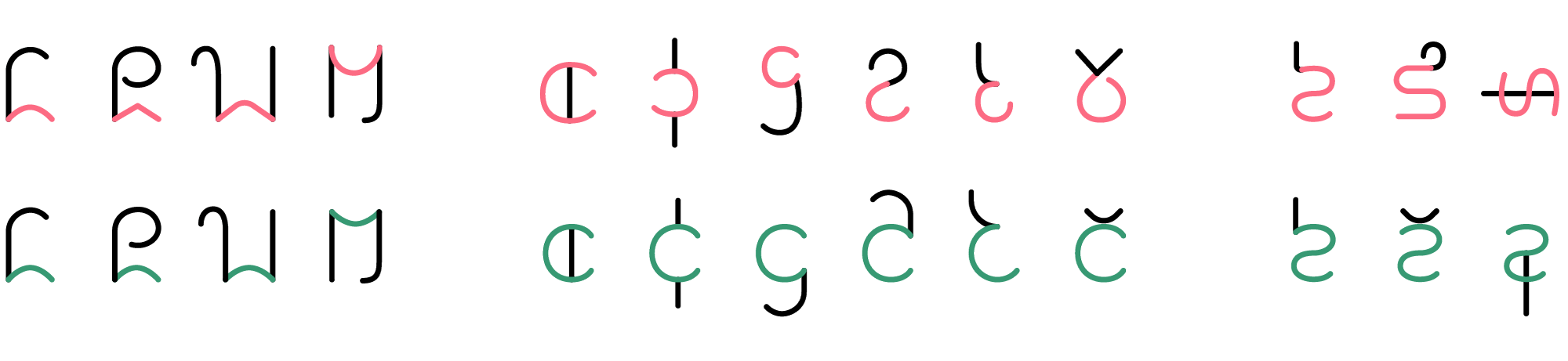
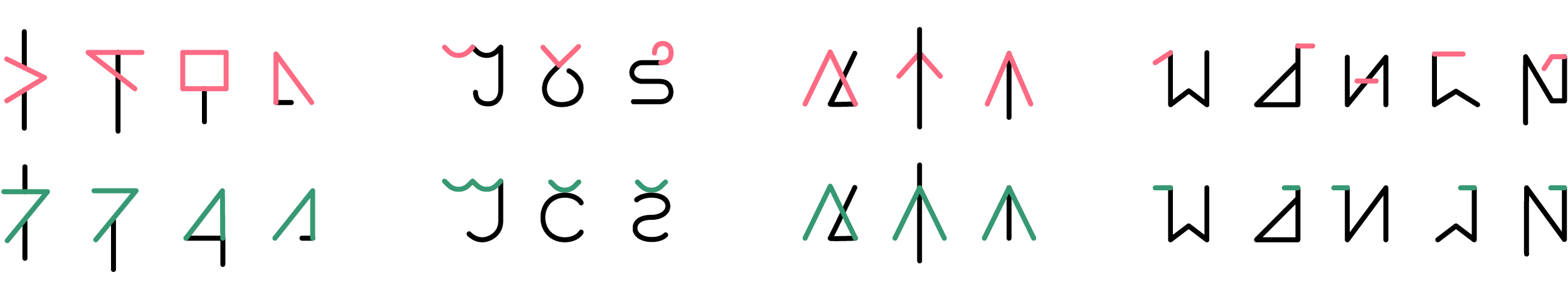
All these cohesiveness fixes were applied to the demo scripts at once, in no particular order, so the thought process might not be obvious just by looking at the before and after. Here’s how they look now:

We’re not done yet, but it’s already much cleaner. There’s less visual tension from crowded or clashing lines, and our eyes more easily rest on it. You can stand back and see it almost blend into a regular pattern or texture.
3.2 Alignment
Alignment is what separates amateur scribbles from refined designs, yet it’s so simple and easy! Alignment is essential in calligraphy and typography, and is also the secret to neat handwriting and penmanship.
The Roman alphabet is structured along several horizontal lines, roughly evenly spaced. This is slightly simplified, and the spacing varies among different fonts. The same principle applies for vertical scripts.

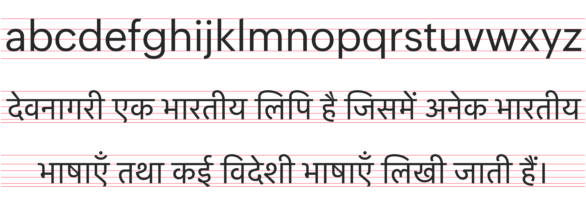
One line you don’t usually find in typography diagrams is the central midline, which guides the placement of details like horizontal or crossed lines. Details are often slightly offset to appear more balanced, though: geometric perfection doesn’t always look right. Roman has one structural midline, Devanagari has two.
It’s not too late in the process to change your character designs for better alignment. Both demo scripts are too simple to add multiple midlines, but we did give version B two different heights for ascenders and descenders: shorter for curves, taller for straight lines.
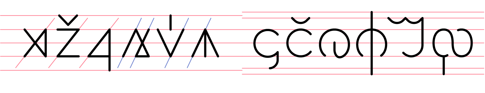
Align vertical and diagonal strokes as much as possible. It’s not always possible with just one standardized angle. For example, it’s geometrically impossible for V and X to have both equal proportions and parallel lines. Version A has two standard diagonal directions, which is fine, but try to minimize differences.
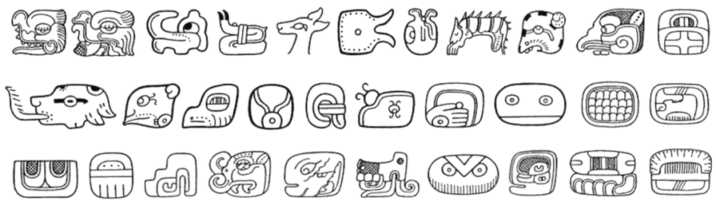
Proportions like width should also be consistent. Some scripts like Chinese and Mayan fit all characters into the same ratio, but most vary in width. In version A, all characters are equally wide, except for V‑shaped ones which are slightly wider. In version B, the last character is an exception, it has noticeably narrower curves but is still the widest overall.
These scripts are actually done now! At least, the plain handwritten versions are. In the next step, we’ll take our scripts to their ultimate form of refinement and beauty.
3.3 Typography and Calligraphy
Many neographers stop after finishing their core design, which is a shame because just a little more work can add so much life and beauty to it. Even if you lack calligraphy tools, design software, and experience, even the humble pencil can render typographical and calligraphic style: just draw the outline!
There are many different styles within each category, and many subtle details beyond the scope of this guide. We encourage you to seek more specific and detailed resources, like those of the typography and calligraphy Reddit communities.
Here, we’ll look at simple things you can do for big stylistic payoffs. Most typography and calligraphy involves some combination of width variation, ornamentation, and artefacts of the writing tools.
Sans serif
The sans serif style is deceptively simple. It appears to just be uniform lines, but they have squared-off endpoints that align horizontally as if sliced off by the alignment guidelines. The cutoff is perpendicular for horizontal lines, and sometimes for diagonal lines with endpoints in the middle of the glyph height.
There are also subtle tricks that counteract optical illusions to make it appear more balanced. For example, horizontal lines are 10-20% thinner than vertical lines, and curves go slightly past guidelines.
Serifs
Basically just slap these little wedge shapes onto the endpoints of lines. They’re usually horizontal as if they’re supporting architectural columns or buttresses, but may be vertical on horizontal lines. Some styles have little circles on the endpoints of small curves. Depending on the structure of your characters and the style you want, consider East Asian style serifs.

Brush
When a brush is pressed to paper, its tip spreads but then narrows as it’s dragged along the surface. Sudden changes in direction also start wide before the bristles reorient and narrow again. The tilt of the brush affects whether a line ends in a tapered point or a slanted wedge.
Don’t try to apply basic Chinese strokes to curved characters; use Hiragana as a reference instead. Even when curved, brushstrokes follow the same profile of thick at first then gradually thinning out, but may thicken on forceful parts like downstrokes. Be sure to follow the general rightward and downward stroke direction as much as possible. It takes care not to turn out looking like Chop Suey.
Fountain pen
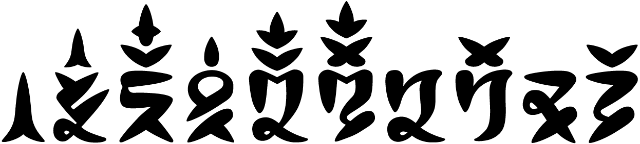
More broadly, this includes varied-width styles in which horizontal strokes are much thinner than vertical strokes, with a gradient of thickness along curves. Fountain pens and marker pens, especially in calligraphy like Copperplate, specifically widen on the downward strokes. This style makes a great hybrid with sans serif, which is what we did for the demo script.
We made minor exceptions on the accents, which are thick horizontally, because the alternatives look awkward. Also, curves that bend towards vertical stay thin if they’re near endpoints, like in the C shapes. As a subtle but elegant embellishment, vertical endpoints have a curved taper to a point instead of a squarish cutoff.
Wide pen
Pens with a wide tip that stay at a fixed-angle produce strokes whose width varies by stroke direction: thinnest parallel to the pen tip, and thickest at 90º angles to it. For fine details and ornamentation, the pen can be tilted to write with the corner point of the tip. This style is beautifully seen in Blackletter, Arabic calligraphy, and Hebrew. Hebrew uses the pen tip at a distinctive vertical angle.

When applying new styles, you might adjust the basic strokes of your script: notice how a new bottom stroke in the top-right character appears in six different characters. This tool works great with curves, but for a more angular Gothic style we would’ve converted round shapes to tall hexagonal shapes.
Cursive
Although many styles of calligraphy are based on cursive, cursive is practical, not decorative. The characteristic curvy, flowing appearance is the result of compromises for speed: loosely articulated motions and reduced pen lifts. You can add extra loops and flourishes later to make it more calligraphic.
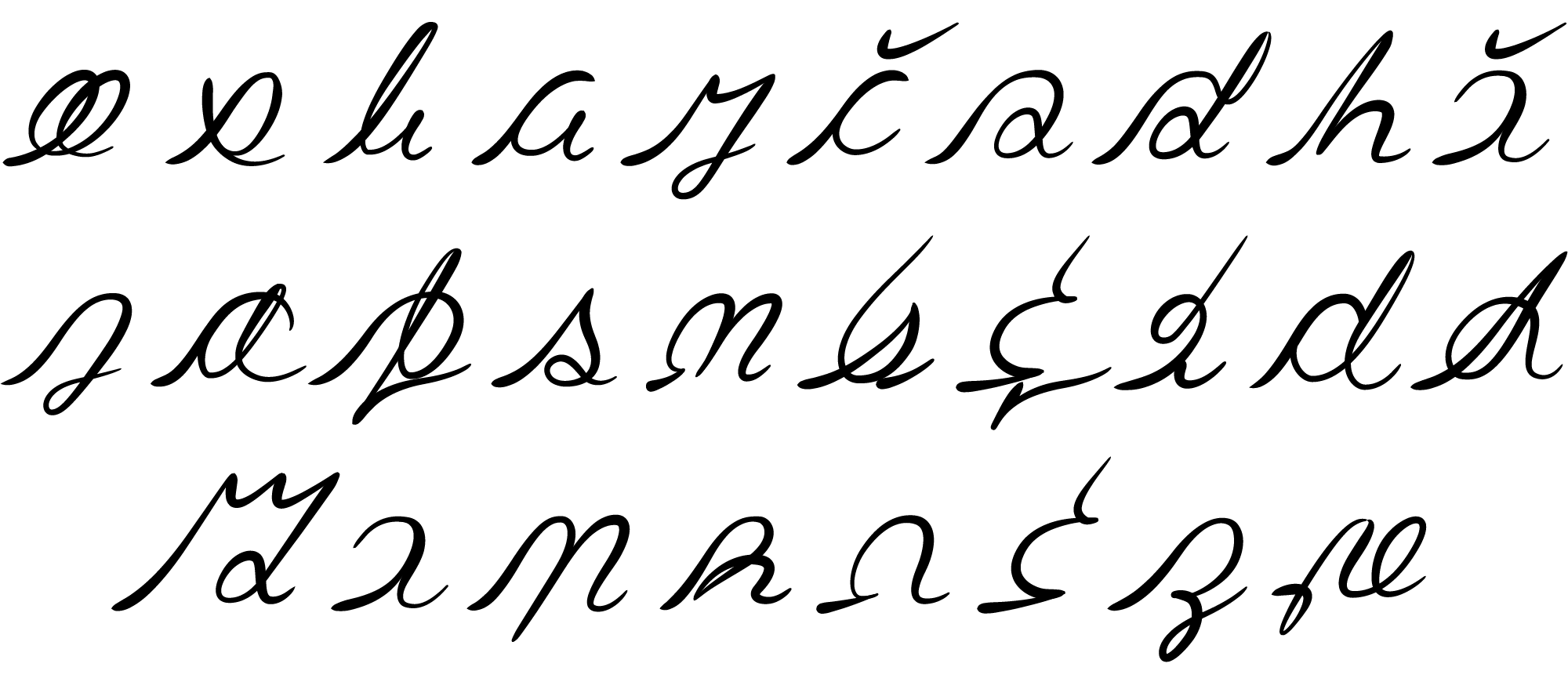
Developing a cursive style requires more trial and experimentation: see if you can actually write it fast. In some ways, it’s like creating a new script all over again. You have to evolve characters into new cursive basic strokes, and might significantly change how some characters look. You might also need to apply a new alignment scheme.
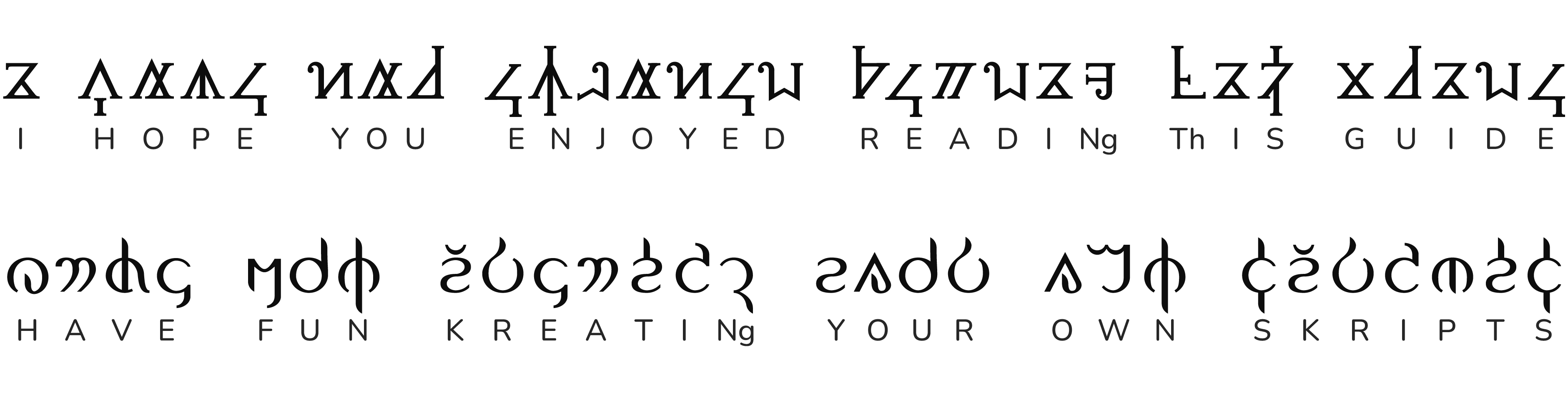
Final thoughts
The demo scripts turned out quite nice! There was no plan for the outcome, they’re simply the result of following the process and applying the design principles.
The structure of this guide separates concepts for clarity, but the reality is less linear. Steps might overlap, change order, and blend together. You might have an aesthetic idea before deciding how it works, and you should think about cohesiveness and alignment while designing the characters, not ignore it and deal with it later.
If you want to go on a deeper dive and learn more about real world writing systems and how they inform script design, see the long version of this guide. It’s a good supplement with lots of information that isn’t included here.
Real projects have unique ideas, goals, and requirements, and rarely follow this exact template. If you want to see the process of real, talented creators showing how and why they created their scripts, check out the neography design showcases!
Neography is a skill that requires practice. Don’t be discouraged if it didn’t turn out the way you hoped on your first try. Keep learning, keep practicing, keep experimenting, and keep creating!